
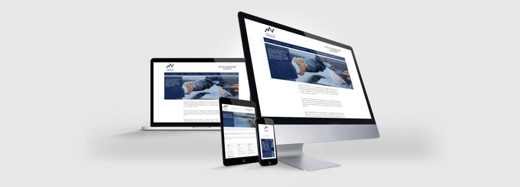
How does your website look on a tablet or mobile?

The Main Issues of “Unresponsive” Design
- Difficult to navigate as the menu protrudes
- Requires the cumbersome pinch-to-zoom function
- Text often appears too small to read
- Call-to-actions are unclear leaving the visitor frustrated
- Google and other search engines penalise non-mobile-ready websites
Over the last couple of years we have seen changes globally in behaviours of internet users brought about by the rise of browsing on mobile and tablet devices. What you may not know is that these two devices overtook traditional desktop browsing in 2014! (Source)
In a world of information-on-demand, all websites can benefit by catering for smaller touch devices or continue to face a decline in business.

Resolved with “Responsive” Design
- Easy to navigate on both desktop and touch-orientated menu
- Fits all content to the width of the screen
- Text and Headings resize depending on the size of the device
- Call-to-actions are clear to the visitor
- Service and retail websites generate more enquires/bookings
- eCommerce websites reduced drop-off and increased sales
Five Benefits of a Responsive Website
- Increased reach to people browsing your website on desktop, mobiles and tablets
- Easier to navigate with touch-based menu, reducing cumbersome pinch-to-zoom
- Better ranking in the mobile search engines
- Increased conversion of visitors into leads for business
- Cost effective using a single template to serve all devices effectively
Lets discuss your requirements, call Capital Web on 01959 447456 (United Kingdom).